
The COVID-19 outbreak is at top of mind for facility managers nationwide. Keep up with the current number of cases in your state with our recently updated interactive map, updated twice a week by our sister publication, the EHS Daily Advisor—read on for how this map has evolved over the past year, plus additional resources for facilities management (FM) professionals.
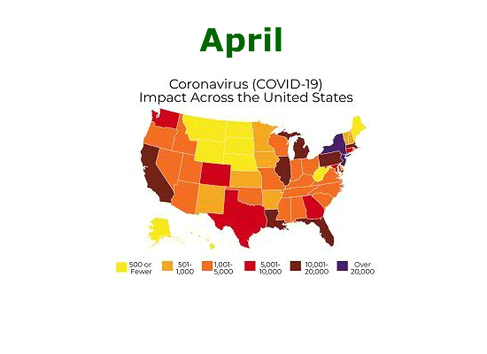
Our interactive map of COVID-19 cases originally launched on March 16, 2020, and after some frequent adjustments in the first few weeks of the pandemic, on April 7 we finally settled on a range that we thought would cover a worst-case scenario—with our darkest purple color denoting a state with 20,000 or more cases.
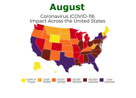
To put that in perspective, if this original legend were still in use as of February 2021, Vermont would be the only state not purple. For additional context, the below animation shows how our original interactive map developed between April 7 and August 7.
However, even an uppermost range of over 200,000 cases would prove to be insufficient. The second animation below shows how our revised map developed between August 12, 2020, and January 31, 2021.
Our new map below (released on February 4, 2021) has yet again increased the numbers within the legend tenfold, with the lowest range set at 50,000 or fewer cases and the highest at over 2,000,000 cases.
These numbers are staggering. And while there are new glimmers of hope in the form of a COVID-19 vaccine and stronger OSHA guidance that proactively seeks to address the health and safety threat posed by the pandemic, it will be a long time before we return to some semblance of what we remember as “normal.”
In the meantime, it’s important for FM professionals to consult reliable resources; here is a short list to help.
- Check out the EHS Daily Advisor’s COVID-19 articles as well as BLR’s Coronavirus Response Center.
- Track COVID-19 updates from the Occupational Safety and Health Administration (OSHA).
- Visit websites for the Centers for Disease Control and Prevention (CDC) and the National Institute for Occupational Safety and Health (NIOSH).
- The National Safety Council’s (NSC) Safe Actions for Employee Returns (SAFER) initiative provides a wide variety of guidance for employers.
- The American Society of Safety Professionals (ASSP) also has a COVID-19 resource center.
Check back here for updates to this map on Mondays and Thursdays until at least mid-March 2021, when we will revisit whether to continue our own updates as we approach this project’s one-year anniversary; note the time stamp in the graphic that indicates when the map was last updated. For more frequent and detailed updates for your area and worldwide, visit our map’s data source, the Johns Hopkins University & Medicine Coronavirus Resource Center.
Thank you, and stay safe!

Loading…
Data source: Johns Hopkins University & Medicine’s Coronavirus Resource Center, which pulls data from WHO, CDC, ECDC, NHC, DXY, and local media reports